


How can nameplates strengthen brand recognition through a unified visual design?
Release Time : 2025-10-02
In today's highly competitive business environment, establishing and communicating a brand image has become crucial for companies to gain market recognition and customer trust. As the "first touchpoint" in a company's physical space, nameplates serve not only as a functional tool for identifying location and ownership but also as a crucial vehicle for conveying brand value and shaping a visual impression. From chain storefront signs to headquarters entrance signage, from office floor wayfinding to exhibition booth design, nameplates, through unified visual design, are becoming an integral part of brand identity systems.
1. Visual Consistency: Building a Brand "Memory Anchor"
The human brain's memory of visual information relies heavily on repetition and consistency. When consumers encounter the same or highly similar visual elements in different locations and at different times, these elements gradually form a solid "memory anchor" in their minds. Nameplates reinforce this process through consistent fonts, colors, graphics, and materials. This consistency allows consumers to quickly identify brands based on color and shape alone, without having to read text, significantly improving the speed and accuracy of brand recognition.
2. Color Psychology: Stimulating Emotional Resonance and Brand Association
Color is the most intuitive and impactful element in nameplate design. A consistent brand color not only has aesthetic value but also carries profound psychological implications. When a company incorporates its primary brand color across all nameplate designs, it subtly reinforces consumers' perception of the brand's attributes. Over time, a specific color itself evokes brand associations, achieving the "identify the brand by its color" communication effect.
3. Fonts and Graphics: Shaping the Brand's Unique Language
Font selection is also a crucial component of brand identity. Steady serifs convey a sense of tradition and authority, suitable for law firms or high-end manufacturers; simple sans serifs convey a sense of modernity and technology, often found in internet companies and innovative enterprises; and handwritten or artistic fonts may emphasize creativity and individuality. The font on the nameplate must be strictly consistent with the brand identity, ensuring legibility at all sizes and in all lighting conditions. Furthermore, the precise presentation of the company logo or symbolic graphics further reinforces the brand's uniqueness. For example, Nike's "swoosh" and Adidas' "trefoil" can independently represent their brands even without text.
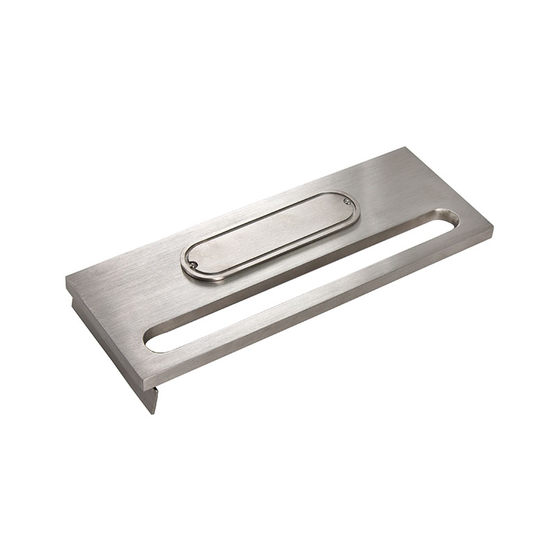
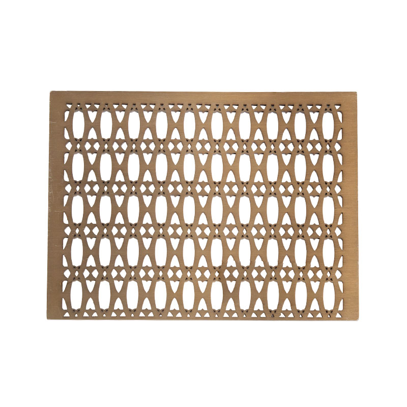
4. Materials and Craftsmanship: Demonstrating Brand Quality and Value Positioning
The material choice and craftsmanship of a nameplate directly influence its quality and appearance. High-end companies often choose metal with fine craftsmanship to create a solid, durable, and professional image; technology companies may prefer a modern design combining acrylic and LEDs; and environmental organizations may use recycled materials to convey a sustainable philosophy. A unified material language not only enhances overall visual harmony but also communicates the brand's commitment to quality and values.
The nameplate carries a significant brand communication mission. Through a unified visual design, it condenses a company's logo, name, colors, font, and material into a recognizable, memorable, and trustworthy overall image. In the minds of consumers, this consistency not only reflects professionalism but also symbolizes brand reliability. In this sense, the nameplate is not only a space identity but also a "silent spokesperson" for the brand, silently strengthening brand recognition and influence with every eye contact.
1. Visual Consistency: Building a Brand "Memory Anchor"
The human brain's memory of visual information relies heavily on repetition and consistency. When consumers encounter the same or highly similar visual elements in different locations and at different times, these elements gradually form a solid "memory anchor" in their minds. Nameplates reinforce this process through consistent fonts, colors, graphics, and materials. This consistency allows consumers to quickly identify brands based on color and shape alone, without having to read text, significantly improving the speed and accuracy of brand recognition.
2. Color Psychology: Stimulating Emotional Resonance and Brand Association
Color is the most intuitive and impactful element in nameplate design. A consistent brand color not only has aesthetic value but also carries profound psychological implications. When a company incorporates its primary brand color across all nameplate designs, it subtly reinforces consumers' perception of the brand's attributes. Over time, a specific color itself evokes brand associations, achieving the "identify the brand by its color" communication effect.
3. Fonts and Graphics: Shaping the Brand's Unique Language
Font selection is also a crucial component of brand identity. Steady serifs convey a sense of tradition and authority, suitable for law firms or high-end manufacturers; simple sans serifs convey a sense of modernity and technology, often found in internet companies and innovative enterprises; and handwritten or artistic fonts may emphasize creativity and individuality. The font on the nameplate must be strictly consistent with the brand identity, ensuring legibility at all sizes and in all lighting conditions. Furthermore, the precise presentation of the company logo or symbolic graphics further reinforces the brand's uniqueness. For example, Nike's "swoosh" and Adidas' "trefoil" can independently represent their brands even without text.
4. Materials and Craftsmanship: Demonstrating Brand Quality and Value Positioning
The material choice and craftsmanship of a nameplate directly influence its quality and appearance. High-end companies often choose metal with fine craftsmanship to create a solid, durable, and professional image; technology companies may prefer a modern design combining acrylic and LEDs; and environmental organizations may use recycled materials to convey a sustainable philosophy. A unified material language not only enhances overall visual harmony but also communicates the brand's commitment to quality and values.
The nameplate carries a significant brand communication mission. Through a unified visual design, it condenses a company's logo, name, colors, font, and material into a recognizable, memorable, and trustworthy overall image. In the minds of consumers, this consistency not only reflects professionalism but also symbolizes brand reliability. In this sense, the nameplate is not only a space identity but also a "silent spokesperson" for the brand, silently strengthening brand recognition and influence with every eye contact.